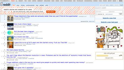
GOOD USABILITY / “BAD” DESIGN
I struggled a bit with this one because it seems like most websites that have good usability have at least somewhat good design. It’s not like Reddit has bad design I just think that there are some improvements they could make. Their usability is incredible so I’ll definitely cut them a little bit of slack in the design department. If Reddit were to focus a little bit more on hierarchy I think their system would be more successful. In places I think that the type is just overly confusing although it does allow for a lot of information to be present.
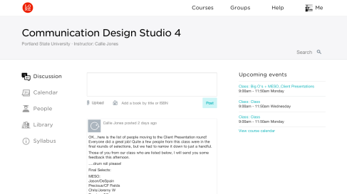
GOOD DESIGN / BAD USABILITY
I’m sure many can attest to the trials and tribulations of Lore. It’s a great idea, but it doesn’t really work that well. It totally works better than D2L or Blackboard, but when students have to go back and forth between all of these different online classroom platforms it gets really confusing. The minimalism of the website looks really nice, but when you need to find something that the teacher posted a couple of weeks ago it can be a real nightmare.

