Yes, it’s using column and images are pretty, yet it’s way too much.
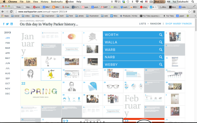
http://www.warbyparker.com/annual-report-2013/
1. The homepage is way too busy. All the icons are too small, though the big animation gets too much attention.
2. Even though there are navigation systems to jump to each month, there are too many contents in the one long page. No one would open the all contents.
3. Some of the type treatment is odd. Ex: name of the month is way too big and creating weird negative spaces.
4. Since there are a lot of contents, there should be more navigation system to sort them in categories.
5. Some of the thumbnails have too complicate images. Simple icons would make more organizations.
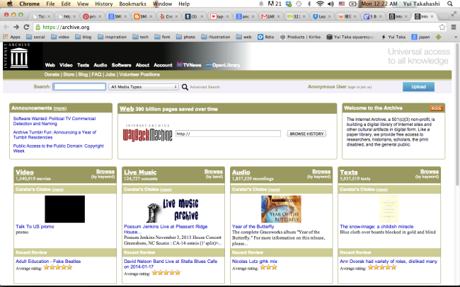
1. There are a lot of texts, adding images of books and articles would help to effectively introduce more items to viewer.
2. Its layout can be more organized and follow the columns. There are weird uneven spaces between contents.
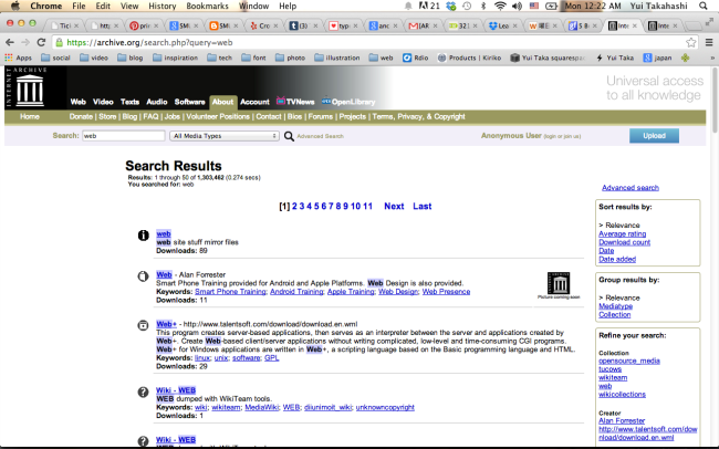
3. In search page, there is a wired white space on the left side.
4. Can’t find the meaning of each icon because they are unclickable and there is no explanation of icons.
5. More varieties of font size, family and colors are needed to make hierarchy better.


